A good manufacturer’s website does not start with the slogan “we are innovative”, but with answers to simple questions: what is it, what is it made of and how do I order it. For the ECODDC brand from Bydgoszcz we prepared exactly that: ecoddc.pl. It is the company website of a manufacturer of eco-friendly desk organisers made of corrugated cardboard, where the product, the material and the contact form are one click apart. In this case study we show how we designed it for business customers.
In short: a company website for a manufacturer of eco-friendly office organisers
- Client: ECODDC, a manufacturer of desk organisers made of BC corrugated cardboard, Bydgoszcz
- Industry: office products, eco design, sales to businesses
- Scope: graphic design, a multi-page website (home page, two product pages, about us, contact), an enquiry form, a cookie banner, legal pages
- Technologies: HTML5, CSS3, JavaScript, PHP (form handling)
- Website: ecoddc.pl
The challenge: explain an unusual material and present a product for businesses
To many people, a cardboard organiser sounds like a temporary solution. Yet according to the description on the About us page, the brand wants to show that BC corrugated cardboard can be a durable, attractive part of a workstation. The website therefore had to do two things at once: build trust in the material and present the product so that you can picture it on your own desk.
On top of that came features that easily get blurred in communication: CNC machining, the Zero Waste philosophy, recyclability and colour personalisation. Had everything landed on one page without order, the visitor would not tell the product apart from the brand slogans. The brief gave us four requirements:
- a clear separation of the brand and the two products: EcoStack and StarLinkPanel,
- concrete technical data instead of generalities,
- a simple route to an enquiry about a product or personalisation,
- a light, fast website that looks good on both phone and computer.
This is not a typical service website. ECODDC sells physical products, so we subordinated the whole layout of the site to presenting the product, not to a catalogue of services.
How we worked on the project
We began by organising the client’s materials: product descriptions, photos and specifications. From them came an information structure in which the home page explains the idea behind the brand and each product gets its own page with a specification and a gallery. Then we prepared a graphic design based on calm green and the natural colours of cardboard, implemented it in code and tested it at various screen widths. Finally we checked the form, the cookie banner and the legal pages.
The solution: a website that sells a product through explanation
The site consists of a home page, the product pages for EcoStack and StarLinkPanel, the About us page and a contact page. The menu is short and the contact button is highlighted in the header, so visitors do not have to look for a way to get in touch.
Home page: three brand pillars and two products
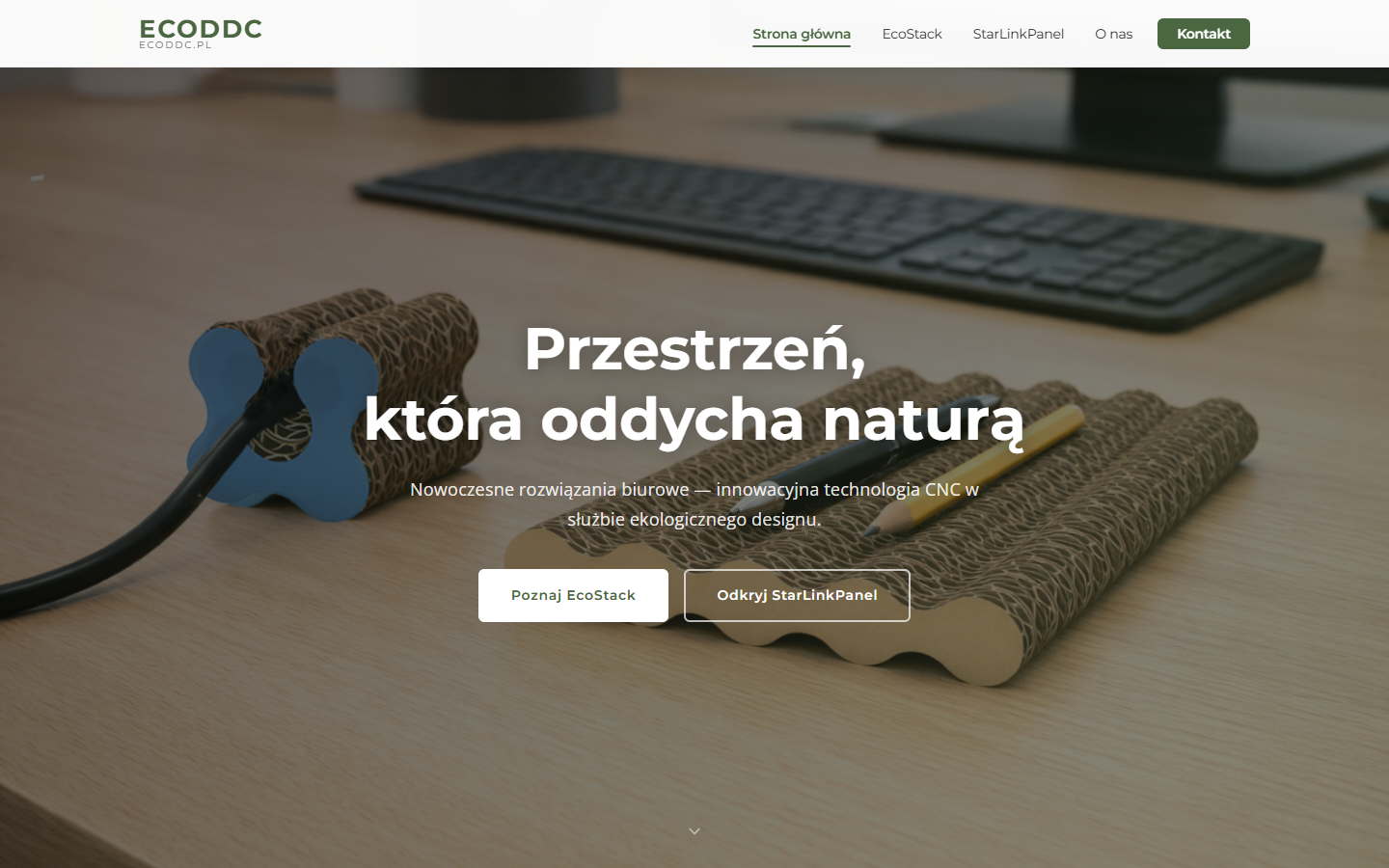
The first screen shows the product in a real setting and two buttons leading to the product pages. Further down, the page presents the three pillars of the brand: CNC technology, Zero Waste and recycling. They are given briefly, in three tiles, and only after them come the products. Visitors therefore grasp the idea first and then see how it translates into specific products.
A Zero Waste diagram instead of a long description
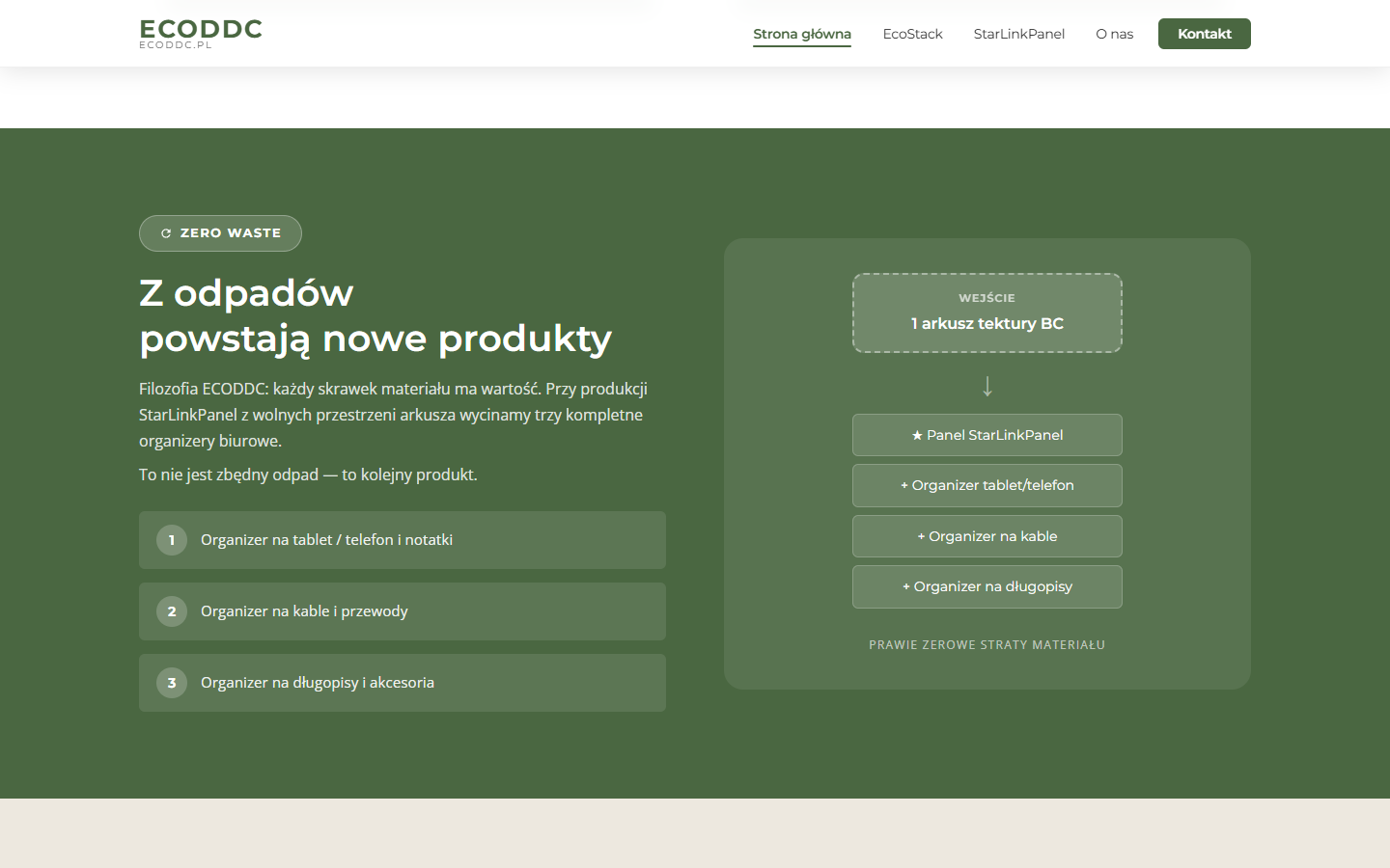
Instead of a paragraph about reducing waste, we prepared a simple diagram: the input is a sheet of BC cardboard, and the output is the StarLinkPanel and three additional organisers (for a tablet or phone, for cables and for pens). According to the website, these additional products are made from the sheet’s spare areas. Such a visualisation explains the concept in a few seconds.
Product pages with a specification and gallery
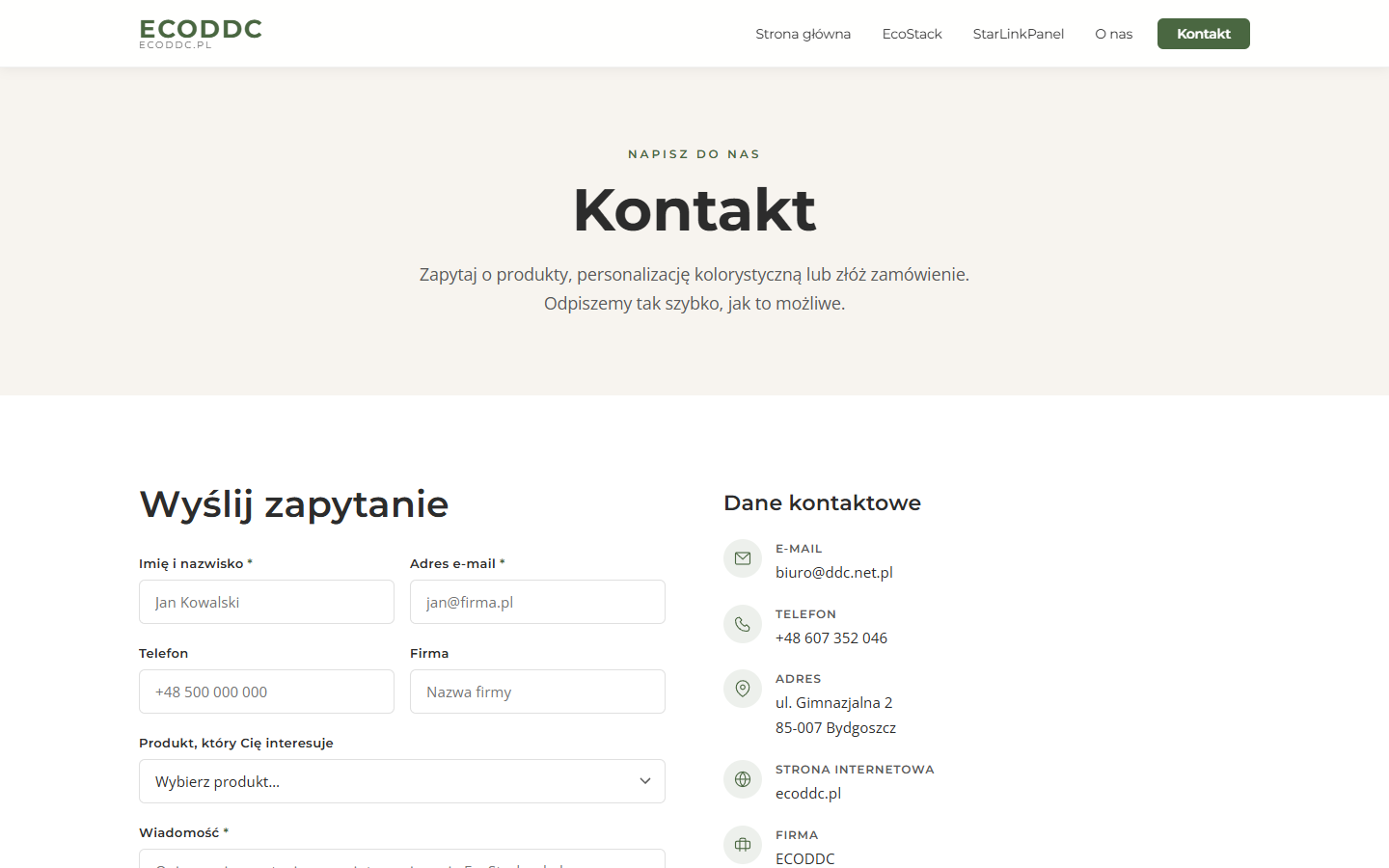
Each product has its own page with a description, a list of features, a technical data table and a photo gallery enlarged in a lightweight lightbox. On the EcoStack page, for example, it says that the stationery module has 25 layers of cardboard and the cable module 6 layers, and that the modules can be stacked on top of each other or placed side by side. All of it is rounded off by a three-step “How does it work?” process: choose the modules, choose the colour and arrange them to suit your needs.
An enquiry form with product selection
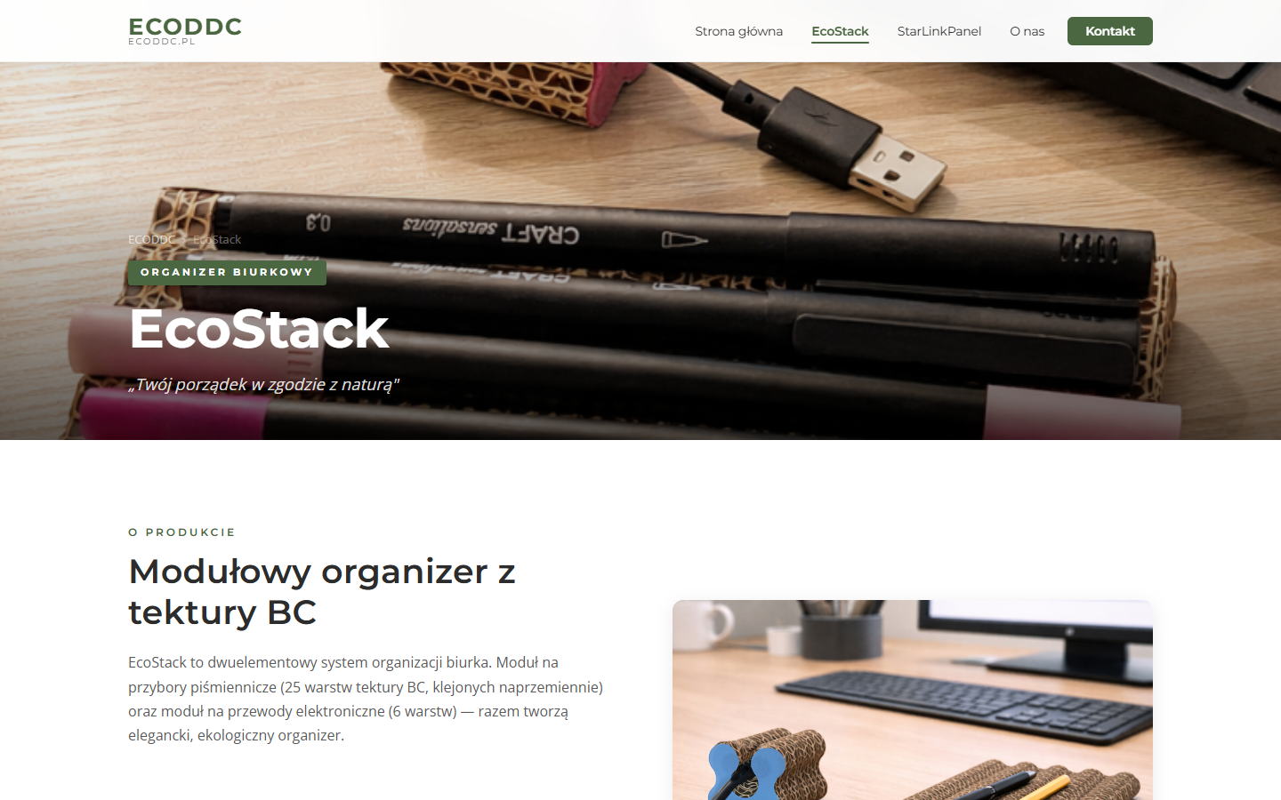
The contact page has a form: name, email, optionally phone and company, a list of products (EcoStack, StarLinkPanel, both, personalisation or another enquiry) and a message. Next to it are the company’s contact details and a map. The form is sent without reloading the page, and the user immediately sees a confirmation or an error message.
Colour personalisation as part of the offer
According to the website, the products are laminated with paper in a chosen colour, and the home page shows a palette: kraft, blue, terracotta, green, violet, pink, graphite, straw and beige. Below the palette is an invitation to ask about another colour. It is a simple way to show that the product can be matched to a company’s visual identity without building a configurator.
About us page: the brand philosophy in one place
The content about the brand’s values was not scattered across the whole site. On the About us page we gathered the company’s philosophy, a description of the BC material and a list of what, according to the brand, sets it apart: its own alternating-gluing method, the star-shaped connectors in the StarLinkPanel, personalisation and a closed material loop. This keeps the home page and product pages concise, and anyone who wants to know more has somewhere to go.
Responsiveness and accessibility
The layout adapts to the screen width thanks to a set of CSS rules for phones and tablets. Images in the lower sections load lazily, so the first screen does not wait for the whole gallery, and users who have switched off animations in their system do not get moving effects. The lightbox buttons have descriptions for screen readers, and the form fields have labels.
SEO, GDPR and security
Each page has its own title and meta description, and the home page has a canonical address and Open Graph tags, so a shared link looks good. We do not promise rankings on Google, because they depend on many factors beyond the code, but the content is organised and described so that a search engine can understand it.
- GDPR (RODO): the form requires consent to data processing for the purpose of answering the enquiry; the website has a privacy policy and terms and conditions.
- Cookies: a banner with the options “Accept all”, “Necessary only” and “Manage settings”, and a link in the footer to change preferences.
- Form: server-side validation, a hidden anti-bot field and rejection of newline characters in fields that end up in message headers.
Technologies
The website does not use WordPress. It consists of static HTML5 pages with CSS styles, a single JavaScript file (animations as sections appear, the lightbox, form submission and cookie handling) and a PHP script that receives the form and sends the message to the company’s mailbox. The contact map loads lazily, and the fonts come from Google Fonts. This choice makes sense with a few fixed pages: it is fast, simple and cheap to maintain.
Why your own website and not just a product catalogue
A manufacturer that describes its products only in listings on portals gives up control over how they are presented and competes on price with similar items. Your own website lets you tell the story of the material and the process, show technical data in a layout the brand chooses and take enquiries directly, without an intermediary. For ECODDC this is especially important, because the value of the product lies in how it is made, and that is hard to fit into a standard marketplace description.
The result
The client received a website that clearly separates the brand and the two products, explains an unusual material and leads to an enquiry. We do not give sales or visit figures because we do not publish them. The qualitative effect is visible in the structure itself: every piece of information has its place, and the path from a product photo to the form is a few clicks. Claims about ecology and recycling come from the brand and that is how we present them. The website is ready to grow: further products can be added as new pages in the same layout, without rebuilding the whole.
Who this solution is for
This approach suits manufacturers and small workshops that have one to a few products, sell to businesses and need a website that explains a technology or material. If a product requires arrangements before purchase, such as colour, dimensions or quantity, an enquiry form is better than a shopping cart. See also our services.
A manufacturer’s website for businesses: how to present the material and prompt an enquiry
According to its description, ECODDC is a brand from Bydgoszcz that sells corrugated cardboard organisers to businesses. Such an offer needs a website that explains the material, shows technical data and collects enquiries rather than imitating a shop. The order works well here: first the idea behind the brand, then the products, and finally a form with a choice of product and personalisation. In B2B sales the customer often needs arrangements before purchase, such as colour or quantity, so an enquiry can be better than a cart.
This website is static, without WordPress, and that is a sensible choice with a few fixed pages: it is fast and simple to maintain. How speed affects the perception of a website is explained in the article on optimising WordPress website speed. We write about presenting a product on screens of different sizes in the text on website design. You will find a similar philosophy of a light business card site in the project website for the juice producer Sokoniada.
Want to know how much such a website costs? Use the quote calculator, browse the services or get in touch with us.
FAQ
Does a website for a manufacturer of products for businesses have to have an online shop?
Not always. ECODDC shows products, parameters and the option of personalisation, and an order begins with an enquiry from the form. For products tailored to a company, for example by colour, such a model can be more convenient than a cart, because the details have to be agreed first.
Why doesn’t this website run on WordPress?
The site has a few fixed pages and little content that changes over time, so static HTML with a single PHP script for the form is entirely sufficient. It is fast, simple to maintain and has a smaller attack surface than an extensive CMS. If content starts to grow, it can be moved to WordPress.
How do you describe an eco-friendly product without overstating the claims?
It is worth sticking to what the manufacturer can justify: the material, the production method, recyclability. Slogans such as “100% eco-friendly” on the ECODDC website are the brand’s claims and we treat them as such. The company is responsible for the accuracy of its claims, and we make sure they are presented clearly.
What does an enquiry form give you compared with just an email address?
The form gathers the necessary information straight away: contact details, the company and the product the question concerns. This allows the first reply to be specific. In addition, there is server-side validation, GDPR (RODO) consent and a hidden anti-bot field.
How long does it take to prepare such a business card website for a manufacturer?
The time depends on the number of products, how ready the photos and texts are and whether an additional feature is needed. That is why we do not give fixed deadlines without a conversation. After a short brief we can define the scope and schedule for a specific company.
Looking for a website for a manufacturer or a product brand? See our services, check other projects or write to us, and we will prepare a proposal tailored to your company.


